TKMilhas – UI Improvements for a Flight Booking Website
TKMilhas is a website that helps users find and book flights using travel miles. While the platform already had an existing landing page, it lacked visual consistency and modern UI elements that enhance user engagement. My role was to refine the user interface, improve layout clarity, and ensure a visually appealing experience while maintaining brand identity.
Problem Statement
The existing TKMilhas landing page had several UI challenges that impacted usability and user engagement:
Inconsistent Visual Design – Fonts, colors, and spacing were not aligned with a cohesive style.
Cluttered Layout – Information was not well-structured, making it harder for users to navigate.
Weak Call-to-Action (CTA) – Users were not clearly guided toward booking a flight.
Low Visual Hierarchy – Key content (offers, benefits, and CTA) was not easily scannable.
My Role & Process
As a UI Designer, I was responsible for improving the visual appeal and usability of the TKMilhas landing page. My contributions included:
UI Audit: Reviewed the existing page to identify inconsistencies in typography, colors, and layout.
Visual Redesign: Enhanced branding elements, ensuring a more modern and cohesive style.
Improved CTA Visibility: Adjusted button placement and contrast to increase conversions.
Layout Optimization: Created a cleaner structure with better spacing and alignment.
High-Fidelity Mockups: Designed and tested new UI elements before implementation.

Final Solution & Impact
The updated TKMilhas landing page improved usability and visual appeal. Key improvements:
Stronger Visual Hierarchy – Used clear headings, better spacing, and bold CTAs for easy scanning.
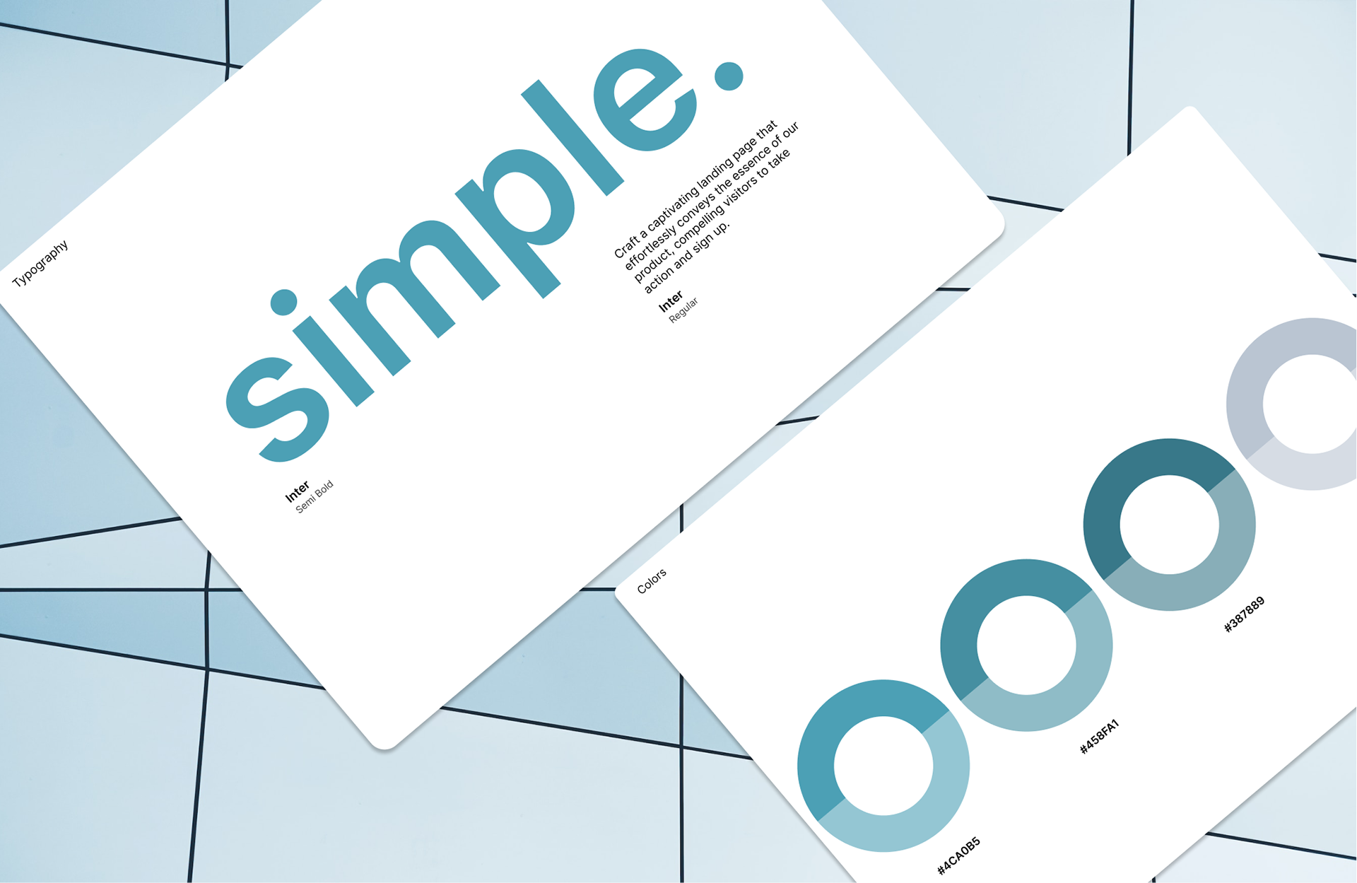
Brand Consistency – Unified typography, color palette, and button styles for a professional look.
Optimized CTA Placement – Ensured that booking buttons were visible and easy to find.
Cleaner Layout – Reduced visual clutter, making the page easier to navigate.
Lessons Learned
This project reinforced the importance of small UI changes in improving user engagement. I learned how better layout structure and consistent branding can enhance trust and usability. Additionally, optimizing CTA placement showed me how minor design decisions can have a major impact on conversions.

